Since his $44 billion takeover of Twitter, Elon Musk barrelled ahead with rebranding the social media channel to X. And I say “rebranding” whilst trying not to spit out my coffee. What even was that? Let’s check out some of the whopping mistakes Musk and his team have made to date. I will also walk you through some rebranding essentials.
X Marks the Spot – Or Does It?
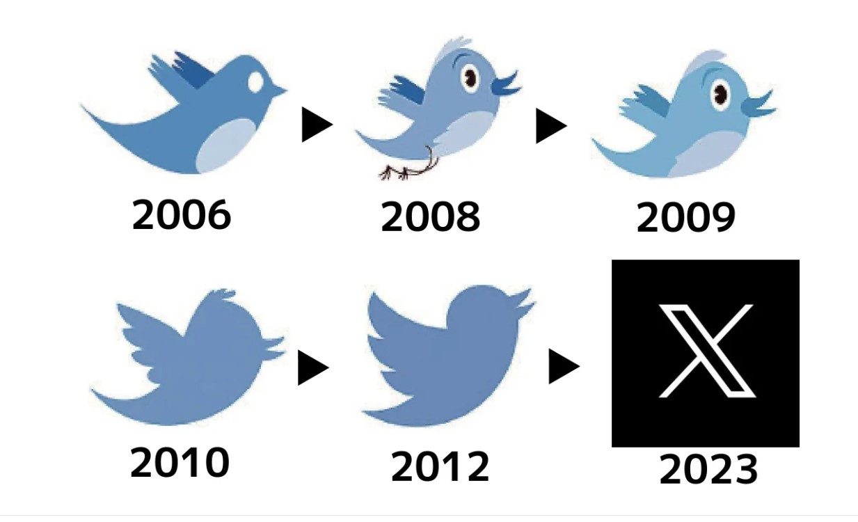
When it comes to rebranding, getting the logo right is a must. It’s how your brand will be recognised and should therefore be unique, distinctive and protected, so that others can’t copy it. Your logo will show up everywhere. There’s no escaping it. But Musk’s X logo, which quickly replaced the company’s iconic bird at the San Francisco headquarters back in July, already has its fair share of problems.
That’s right, trademark lawyers have been sending legal warnings to billionaire Musk as the letter X is so widely used that it could become a candidate for legal challenges. To highlight this issue, rock band Metallica, software giant Microsoft, carmaker Honda and sportswear brand Adidas all own versions of X as a trademark. Even Meta, whose new Threads platform is a Twitter rival, owns a federal trademark registered in 2019 covering a blue-and-white letter ‘X’ for fields including software and social media. There are, indeed, a reported 262 ‘Xs’ registered as trademarks with the European Union’s Intellectual Property Office – ouch. However this doesn’t seem to be the case for X, AKA Twitter. Speaking of this issue, trademark lawyer, David Krantz, said:
If one plans to change the name, certainly a well-known name, you would expect the intellectual property rights in this respect to be secured. This appears not to be the case.
Douglas Masters, a trademark attorney also stated:
Given the difficulty in protecting a single letter, especially one as popular commercially as ‘X’, Twitter’s protection is likely to be confined to very similar graphics to their X logo. The logo does not have much distinctive about it, so the protection will be very narrow.
And it seems Musk’s reasons for choosing X as his ‘app of everything’ logo aren’t strong either. According to the entrepreneur, X was appropriate because he wanted something that “embodies the imperfections in us all that makes us unique.” Right. The X logo has even been scrutinised for looking like a character in the Monotype database. It also looks similar to something from Unicode and even though that wouldn’t cause any particular licensing issues, it’s not exactly clever or unique to have a logo that looks like the popular sans serif version of an X glyph is it?
Despite the battle of the Xs, many find the new ‘Twitter’ X a harsh replacement for the pretty bird that used to represent the social platform. One Twitter users commented:
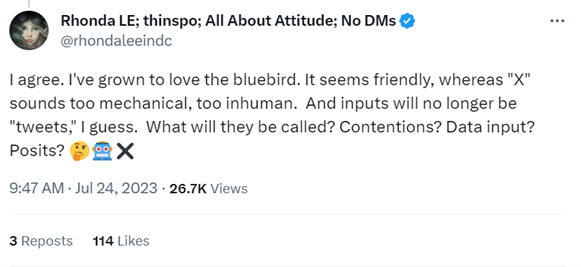
And they’re not wrong. Twitter branding resonated with audiences. It was clear, honest and consistent. The logo was unique, the colour scheme was instantly recognisable and the tools were simple and easy-to-use. So much so that the platform had a whopping 230 million active users before the Musk takeover. My favourite comments on the new logo are below:
![]()
![]()
Other users have commented that the logo looks like an adult site. Many have deleted it from their phones for that exact reason.
Rebranding Inconsistencies
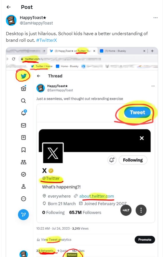
Musk’s Twitter rebrand has been slammed from the start, with one ‘X’ user noting how the desktop page had far more references to Twitter than the new X branding: “Desktop is just hilarious. School kids have a better understanding of brand roll out.” Even brands chimed in, with Channel 4 stating: “People still call our streaming service 4OD, so good luck.” X’s launch has been somewhat clunky and unimaginative, especially when compared to the well thought-out ecosystem of Twitter.
In what is now just a sad memory, Twitter was represented by a bird and users were encouraged to Tweet. Cute. The home icon was a bird house and the picture offered for new accounts was an egg. The write button was even a feather and bird-related words such as ‘Retweet’ and ‘Fleets’ dominated Twitter lingo. Smart. Twitter users have been quick to identify X’s apparent lack of strong branding or consistency.
X’s ‘good brand story’ has yet to be seen. The changes made to date have been mundane, boring and completely unimaginative. According to the latest Beta updates from X News Daily, Tweets are now just ‘Posts’ and ‘Retweets’ are now just ‘Reposts.’ Musk certainly has huge technology-based plans for the future. But his strategy so far has alienated users and lost, actually massively haemorrhaged, advertising revenue.
Essential Steps for a Rebrand
If you’re considering a rebrand, it’s important to plan carefully. Perhaps the demographic of your audience has shifted in recent years and you need a younger – or more mature – identity. Maybe you’ve extended your services or partnered with another company so you need to update your logo and taglines to become more inclusive. Whatever the case, understanding your goals is the first step to a successful rebrand. After that, you should think about:
Changing Your Logo
A new logo is a great way to let people know that your identity is different. But tread carefully. Consumers aren’t great with change and there might be a fun way to tweak your existing logo without sending your followers into a spiral of confusion and even anger. Burger King did this well back in 2021 during their first rebrand in 20 years. Ditching their shiny, modern logo for a retro alternative, the brand was keen to celebrate the fast-food restaurant’s food and its past.
Logo designer Lisa Smith said, “We were inspired by how it (Burger King) has grown to have such an iconic place in culture – from Back to the Future, Gremlins through to more recently Stranger Things and BK’s Warhol campaign.” She continued, “The new logo pays homage to the brand’s heritage with a refined design that’s confident, simple and fun.”
![]()
Shifting your Brand Position
Rebrands often happen when brands have new missions, values and visions. Such details should be included in your marketing. If your business once operated on a small scale but is now global, you might want to add simple but significant details to your naming structure. The word ‘international’ for example, tells people you’ve scaled up. If you’ve ‘gone green’ and become an eco-friendly company, you might want to update your messaging to explain your new position in the market. But it’s important to be mindful of the consumers buying your product. Anyone using social media has seen the slogan “Go Woke, Go Broke” in the past year. This is essentially large swathes of consumers boycotting products or brands for missing the mark or alienating their consumer base.
Updating your Slogan
Based on your new name and brand position, you might find that a new slogan is appropriate. But ask yourself why you really want it to change. Do you have a particular message you’re trying to communicate? Are you trying to draw your target audience closer? A slogan is part of your identity and must therefore be given careful thought. It also needs to last the test of time so it shouldn’t be created around a short term campaign. If you’re not sure where to start, take a look at the below starting points:
– Make a claim – Disneyland’s ‘The Happiest Place on Earth’ does just that and literally tells people how and what they should feel about their attraction.
– Provide instructions – think of Nike’s ‘Just Do It’ slogan and how it leaves no room for excuses or procrastination.
– Compliment customers – L’Oreal’s slogan ‘Because you’re worth it’ is a good example of how to make people feel great using just a few words.
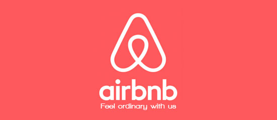
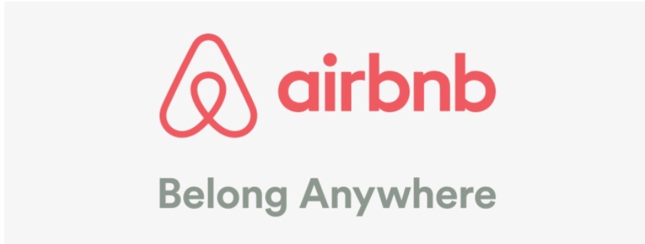
Sometimes brands just starting out don’t have the marketing and branding expertise to make a great job of it first time around. They then update when they gain popularity and of course funding. A great example is airbnb. Their original slogan “Feel ordinary with us” just sounds wrong. Why would I want to feel ordinary? It’s not giving me vacation vibes at all!
But then they updated to “Belong Anywhere” and it’s giving me travel, adventure, acceptance and diversity. Good job airbnb.
Changing Your Tone of Voice
If you’re a comical brand like Charmin or Innocent, shifting to a more serious, formal tone of voice will likely harm your brand’s identity – unless you’ve a good reason for it. After all, you did a great job of carving a space and identity for yourself within a competitive market. Think about the type of brand you want to be. Do you want to appear authoritative and factual? Will you be funny and light-hearted? Whatever you decide, it’s important to be consistent. Have your marketing agency draw up a tone of voice document (TOV) that can be followed by all marketers and start to build credibility through content marketing. It’s essential to be mindful of your product, service and audience too. That’s not to say that more serious companies can’t be funny too though. Check out the top 10 over at Contentworks.
Tracking Brand Sentiment
Musk, this one’s for you! People might not like change to begin with, but hopefully, they’ll soften. That said, it’s important to track brand sentiment along the way by asking for feedback and using social listening tools to monitor social media. If your negative sentiment doesn’t get better with time, you may have to go back to the drawing board. Sometimes, consumers will share ideas that might be worth implementing down the line. Whatever the case, note that you might not get it right the first time, especially if you’re working independently with no professional guidance. Many brands have messed up in the past including Gap. The well-known and hugely popular fashion brand gave their much-loved logo a modern twist overnight. With sales down, this led to whispers of desperation and erratic behaviour, causing Gap to switch back to its original design after a week. After stating how the new logo was “modern, sexy and cool,” a Gap spokesman then backtracked stating: “We’ve learnt just how much energy there is around our brand, and after much thought, we’ve decided to go back to our iconic blue box logo.”
![]()
Your brand is arguably one of your organisation’s most important assets. It gives your organization an identity, fosters brand loyalty, supports your marketing and advertising, stands out in print and digital format and unites your organisation, however international. As an agency director, I work hard to create winning brands, tone of voice guidelines, logos, strategies and style guides for our clients. Perhaps that’s why the downfall of Twitter hits so hard? Get in contact to discuss your launch or rebrand.