You’re probably aware of the importance of putting out high-quality content on your social channels. But what about your social media design? This too should be thought of as ‘content’; research has found that posts accompanied with an image attract 94% more views than content without. The images you choose to accompany your social media content are crucial. You need to be thinking about image size, resolution, as well as the content of the image and how this aligns with your brand’s existing aesthetic and personality. You want it to match your website so that there is a link and a flow of content, however, if you are revamping your social media channels and they look better than your main website, you may want to contact a web design Southbank company or one similar, to see what they can do so anyone who is visiting your website will like what they see. Here’s a quick rundown on what works and what doesn’t for social media design.
Size Matters (For social media designs)
Getting the right size for your social media images is important. It’s easy to think that sizing isn’t really a big deal – Facebook, Insta, Twitter, LinkedIn, or wherever you’re posting will resize your image anyway, right? Not really. Here’s why you need to design for the channel you’re on.
- Using the wrong size can result in pixilation and image stretching. This looks unprofessional and will deter click-throughs.
- With the right sized image, audiences will definitely be delivered the full photo as it was intended, without text or logos cut off that could ruin the aesthetic or prevent them from seeing branding.
- Showing identical content and images across all channels defeats the object of having a presence on different communities doesn’t it?
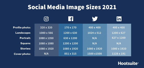
Here’s a quick guide to image sizes across the main social media platforms:
Top apps for image editing
There are plenty of apps out there for editing designs and making them pop on social media. Some you will need a designer onboard to fully utilise. Here are a few of the best ones:
- Sketchbook
- Photoshop
- InDesign
- Canva
- Lightroom
- Prisma
- Bazaart
Content
Did you know that the average person today has an attention span of eight seconds?! Yes, that’s shorter than a goldfish’s (by one second, according to research). This is a decrease of four seconds from 2000 and is thought to be a result of increased use of modern technology and social media where people are bombarded with unending information, making it hard to focus on just one thing. However, Facebook posts accompanied by images see 2.3 times more engagement than those without. Images must be shared on Instagram to even create a post, so if you’re not planning to focus on great imagery, this isn’t the place to be.
What does this mean for brands? Well, it means your brand has to make your content attention-worthy. Nothing grabs attention better than visuals. Visually interesting photos are therefore important when it comes to grabbing attention. One way you could make your photos more interesting is through colorful backgrounds. You could try these exciting neon lights, available at www.neonfilter.com. These colorful and fun lights in the background of images could help when grabbing a reader’s attention and make your photos more impactful and is the key for bloggers to consider when taking images to accompany their content.
In fact, a study found that Facebook statuses accompanied by images had 53% more likes and 104% more comments than statuses that were text only. So, images are crucial for brands.
Social media users upload a total of 3.2 billion images every day, meaning recognising that your brand is up against tough competition is vital. How can you make your content stand out from the crowd? By using images that compel your audience to want to find out more. Diversity within the images you choose is also key since users will tire easily if they constantly see similar images from you. Maybe, as a brand, if you are doing product shoots, you could take a photo of each product with different cool wallpapers or backgrounds that you see fit. Always opt for the styles of images that are proven to drive engagement on social media.
Brand Identity
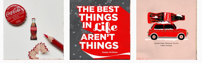
When you hear the name Coca-Cola, there’s a good chance you instantly think of its logo. This has a whole lot going for it. Firstly, it’s simple. Secondly, it uses colours that evoke emotion with red helping to elicit emotion (more on this later). And thirdly the Spencerian script typeface is playful and all about enjoyment. The message? Reach for Coca-Cola when you’re relaxed, happy and winding down for the day. Genius.
The white and red colour scheme is also used consistently across their social media channels to ensure all followers never forget the Coca-Cola marketing. Affiliates, franchises and partners are provided with a complete brand pack including very strong guidelines governing that logo. And rightly so.
TIP – Maintain brand identity on social media by getting your brand colours right, using the same filters and following your brand style guide and logo protocol.
#1 User-generated images
User-generated content (UGC) has the potential to seriously influence your audience. UGC is from the customer, meaning other customers are more likely to perceive it as authentic. An overwhelming 93% of customers think user-generated content is ‘very helpful’ when making a purchasing decision and millennials trust UGC twice as much as brand-generated content.
Apple is a pro at this – pretty much their whole Instagram feed is dedicated to showcasing UGC captured on their customers’ Apple devices:
What’s great about UGC is that, since it’s created by your customers, you really don’t have to do a lot to secure great content to promote on your socials – save your brand time and money. However, you can’t expect UGC to be around whenever you need it, especially if you’re a smaller brand. If you can’t find much UGC content out there that’s representing your brand, you might consider encouraging its creation.
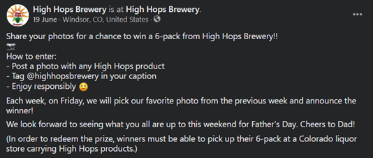
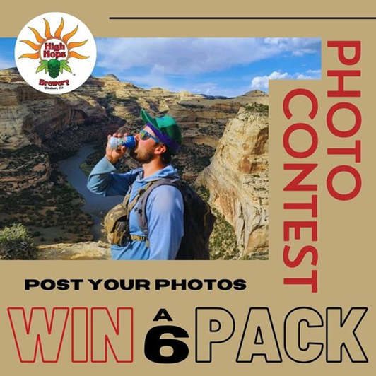
Take a look at Colorado-based High Hops Brewery’s competition below for inspiration. They gave their followers an incentive to post UGC by offering a reward – the prospect of winning a six-pack!
The reward you offer doesn’t have to be huge in value (although it can help if it is!). It could be in the form of an entry to a competition or perhaps a discount on their next purchase. Realistically though, there will need to be some form of incentive to get your audience interested enough to both take and share a photo promoting your brand.
If you want to use UGC on your brand’s accounts, make sure you publicly thank/ acknowledge the photographer or designer as a courtesy. This has the secondary benefit of further encouraging other users to post similar images.
#2 Behind-the-scenes pics
Fans love getting a glimpse into the inner workings of their favourite brands. A recent study by Stackla found that 90% of customers consider authenticity an important factor when deciding which brands to support. The same study concluded that younger generations in particular favour authenticity when it comes to brands, Millennials and Gen Z preferring ‘real and organic’ over ‘perfect and well-packaged.’ Read more about tailoring your marketing strategy to Gen Z here.
Behind-the-scenes images are well-equipped for conveying brand authenticity; they work to show customers that your brand is more than just a faceless/heartless company.
What sort of behind-the-scenes?
- Lunch room snaps
- The assembly of a product
- Company retreats/team building
- Factory/warehouse snapshots
- Employee spotlights
- Community/charity initiative activities
The exact nature of your behind-the-scenes images doesn’t really matter. What’s important is that they convey your authenticity. Make customers feel like they’re getting an exclusive look into the ongoing of your business.
#3 Product images
Only around one in five posts should exclusively focus on your products or services – consumers are already bombarded with ads and product posts (with the average person seeing a startling 6,000 to 10,000 ads every single day). You don’t want to add to this noise in a big way. Keeping your promotional posts to a minimum means that when you do share an image of a product, your followers are going to be more interested.
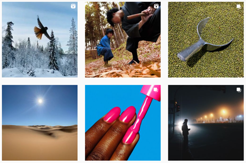
With your brand competing for consumers’ attention, you’ll want to make sure you only share product images that wow. Take Wearth London’s Instagram feed below as an example.

Out of these six posts, only one is marketing the brand’s products (the shampoo and conditioner bars shown in the upper middle post). The products in this shot aren’t even the main focus, with the accompanying text explaining the benefits of shampoo and conditioner bars in general. The rest of the brand’s posts in our screenshot above are educational, informative, inspirational, or promotion of other eco-friendly small businesses. The products Wearth London do post are presented in use, not just using a low-effort white backdrop; this helps customers envision themselves using the product.
Multi-frame carousels get your audience engaged by swiping, while information-rich social content goes a long way to better educate your customers. Carousel posts are most effective when sharing related images. Outfit items that go together or home decor items that complement one another.
Check out this awesome article on colour palettes that go well together. Collating your collection is so important!
#4 Brand messaging
Social media is a great place to get important messages to your fans. This could be done in brief by using a text overlay on an eye-catching and relevant image with further info in the post. You could choose to announce an upcoming event, sale, that you’re hiring, or new working hours.
72% of those surveyed in a recent Nextdoor poll believe they will frequent local businesses more regularly. As a small business, tapping into a community-minded approach can make a huge difference on the road to recovery. It’s critical to ensure your brand imagery reflects the diversity of the community where you operate. Through your visual communications, you can support, represent, and empower all voices and identities.
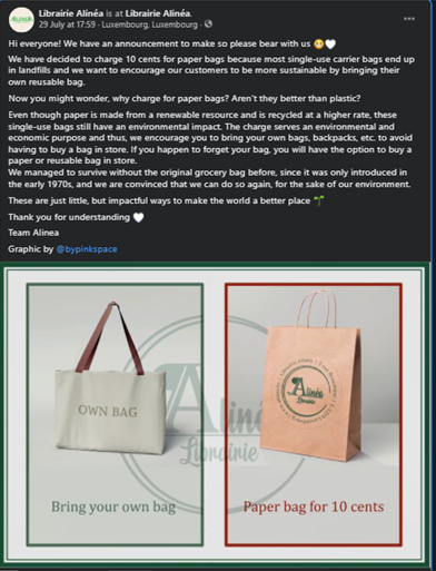
This book shop’s post above is a perfect example. The image explains their new bag policy in a way that couldn’t be simpler, but the accompanying post goes into more detail for customers that want to find out more.
How can I take amazing photos for brand’s socials?
We understand the importance of collating amazing imagery on our social media platforms, but how do we do it? Whether you’re snapping on your phone or using the latest and greatest professional camera, there are a few tricks to up engagement even more.
#1 Use the gridlines feature
The rule of thirds is probably the most basic photography concept there is. The rule of thirds is a composition technique that puts the subject in the left or right third of an image, with the other two thirds less occupied. The best way to do this is by using the gridlines feature offered by smartphones and digital cameras.

Basically, just put your subject where the lines cross to create visually appealing shots. The rule of thirds works because the viewer first looks at the centre, and their eye is then drawn to the subject.
#2 Crop, but never zoom
Zooming, especially on a phone, lessens the resolution of your photo. Instead, if you want to get rid of background clutter, just crop the image or simply move closer to the subject. Try to avoid complicated fussy backgrounds. Instagrammers especially love clean lines and empty backgrounds.
#3 Symmetry
Similarly, symmetry is something humans are instinctively drawn to. Use gridlines for this too. Not all images have to be symmetrical. But if that’s what you’re aiming for, make sure they’re pretty much perfect – unintentionally off-centre images drive people nuts. Free tools in image editing software can also help you line things up.
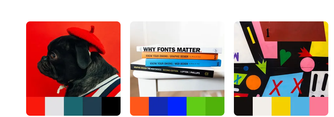
#4 Use colour psychology to your advantage
Did you know that close to 85% make purchasing decisions based on the colour of the product? Colour also triggers an emotional response in humans, with certain colours denoting certain emotions. Here’s a breakdown of which colours trigger certain emotional responses:
- Green: Freshness, environment, money, start
- Blue: Trustworthiness, approachable, soothing
- Red: Anger, urgency, passion, energy, romance
- Purple: Intellectual, regal, luxurious
- Yellow: Joy, happiness, peace
- White: Cleanliness, emptiness, purity, simplicity, innocence
Prolific painter and art theorist Wassilly Kandinsky may have put it best when he said: “Color is a power, which directly influences the soul.”
#5 Don’t over Photoshop
Fans are pretty savvy these days and too many filters, using Photoshop brushes, effects or editing tools in the app though are made to improve the user experience, it is often seen that people may or may not take to it. This is especially true when it comes to fashion or body image. Nothing says inauthentic like a heavily filtered image. Keep it real and avoid being called out for your PS fails.
Did you know: A new law in Norway is coming into force that will mean social media influencers can’t post modified photos without declaring what they’ve done. The rules will affect any paid posts across all social media platforms, as part of an effort to “reduce body pressure” among young people. It’s certainly a good thing and one that advertisers and brands should be behind.
“Among other things, a duty is introduced to mark retouched or otherwise manipulated advertising when this means that the person’s body in the advertisements deviates from reality in terms of body shape, size and skin,”
It will cover filters, like you might use on Snapchat, as well as digital alterations of things like body shape and size. It affects anyone who is posting a paid promotion on social media – including many influencers, actors and singers.
#6 Keep it happy!
Social media posts with positive, happy vibes get more shares and engagement than those that stir up fear, hate or unhappiness. Big YAY to this. Even better, graphic designer and brand strategist Nicte Cuevas tells us that happier palettes, like warm tones or primary colours (reds, yellows, blues) can lead to more sales for your small business.
#7 Attention to detail
Small changes can make all the difference when it comes to getting the right photo for social media. Pay attention to lighter, use a stand if your hand is likely to shake and take plenty of different photos from alternate angles so you can choose the best one.
Did you enjoy reading Social Media Design – What Works and What Doesn’t? If you did then hit share! Get in contact to discuss social media management (and social media design) for your brand.