Landing pages … do they work? Yes they do when they are good ones! As a writer and digital manager I have seen awesome landing pages which are high performance conversion machines and I have also seen landing pages which have flopped and died! So then with that in mind I am going to give you 3 factors that make an awesome landing page so your next campaign can fly not flop!
What is a landing page?
A landing page is a single page website designed to capture information, registrations, signups or prompt a purchase. Unlike a traditional website, a landing page offers no distractions and a simple and clear CTA (call to action). If correctly designed, a landing page will increase the success of your campaign. You can have thousands of landing pages running at the same time, each promoting a different product and using different keywords… in fact the more the merrier!
What makes a good landing page?
It goes without saying that you need to have input from a professional writer and graphic designer to create an awesome landing page. A good landing page, however, can be loosely attributed to the following 3 factors:
Loving this LP from Wodsites AU which keeps it nice and simple to aid conversions.
#1 An Engaging Headline
Trust me, an engaging headline can and will make or break the success of your landing page! Ideally you should aim for a short headline followed by a sentence explaining it in more detail. Below I am going to show you the right and wrong way to right a headline for your landing page. The key takeaway here is to keep it punchy and short whilst also providing the specifics and of course a little urgency on the CTA!
Right Headline
20% OFF ALL BEACHWEAR!
Look cool this summer with 20% off all sandals & swimwear until Friday 20th!
Wrong Headline
OUR COMPANY, EXPERTS IN WOMEN’S CLOTHING ARE OFFERING YOU A DISCOUNT ON BEACHWEAR
#2 Awesome Content
Sure, awesome content … blah blah blah but what specifically makes awesome content for your landing page? Consider the following:
AIDA Attention, Interest, Desire, Action
Attention– get their attention with an irresistible headline. Make it fun, make it catchy and make it head turning.
Interest– Ok, you got their attention but now you have to keep their interest. Your content should be enthusiastic, motivating and informative to ensure that you keep them reading on.
Desire– Your content should be dripping with bait designed to create desire in the minds of the reader. Of course, doing your research prior to writing the page will also help you to understand what turns your potential clients on and makes them want your product.
Action – Your content must constantly drive readers towards taking the next step. Whether you want them to subscribe, buy or claim an offer, everything must be gently pushing them to this point. You must also ensure that there are plenty of CTA buttons and links so that your potential client can easily take the next step.
The tone of your landing page content should be compelling and energy fueled whilst also ticking the keyword boxes for SEO (search engine optimization) purposes.
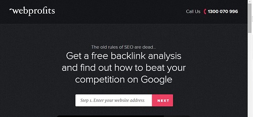
This LP from webprofits has an irresistible hook and minimal text to get you signed up fast! A great landing page will keep the punchy headlines, hook and sign up form at the top and the details further down below the fold… anyone needing more information will scroll down.
#3 Wow Factor Graphics
Never underestimate the power of a “wow factor” graphic or video on your landing page. First impressions count and the image you use is just as important as the headline if not more so. Pair the right image with the right headline and you have a winning combination. Some tips for a wow factor graphic:
- Only use professional/licensed images
- Avoid stereotypical stock photos using models
- Watch the image size and trial your LP layout on all devices
- Keep images and designs simple and clean
- Keep videos short- 30- 50 seconds is best
MORE COOL LANDING PAGE STATS
- A one second delay in page response time can result in a 7% reduction in conversions.(Source: KISSmetrics)
- 90% of visitor who read your headline also read your CTA Copy. (Source: Unbounce)
- Businesses with over 40 landing pages generated a whopping 12 times more leads than those with 1-5 landing pages.(Source: HubSpot)
- Videos on landing pages can improve conversion rates by up to 80 percent.(Source: EyeViewDigital)
So there you have it… 3 Factors That Make An Awesome Landing Page. What do you think makes a great LP? Tweet me @charli_says and let me know.

